Monday, August 15, 2011

1930's LOOK IN TAI TAM

In the Stanley area, a lovely family was making their 3rd move in 4 years .  They needed to create a look that matched their lifestyle.  With two small boys they had kept their home simple and uncluttered but it felt like dorm living. 
  With their current brown leather sofas, brown and blue drapes, and overlooking the bay with it's beautiful blue backdrop. - we had a color pallet forming.

The walls were painted a light blue gray matching a piece of her artwork. 


Looking at their newly purchased Shanghai Arm Chairs - the look of Retro 1930's came to mind.  So this was the direction we took.

LIVING ROOM BEFORE 

ITEMS PURCHASED
The use of artwork can tie the color story together over the sofa. 

Like most of our flats - the living room and dining room - are the same location  - and need to work together. 
DINING ROOM BEFORE

ITEMS PURCHASED

The husband came on a Zhuhai Factory tour  to find a unique piece and inspiration.  The tall kitchen cabinet was found.  It  was stained a very dark brown to match the sofa color.   When delivered - we had Jimmy come out and re-stain the TV cabinet to match. 

THE LOOK

This is a lamp possibility.  The white repeats the table and the brown repeats the sofa. 


The accent table that sits between the Shanghai chairs - repeats the white marble that is on the dining table. 
TULIP TABLE 
Delivering a large marble table can be tricky.  Make sure it fits your elevator - and if you have stairs - it will cost extra.  It will also cost if they have to unpack and then get it into the elevator.  It will also cost to put it together.  It comes directly from the factory - so you save initially.  With the added charges - you are still saving. 


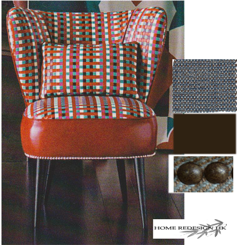
We bounced around over a dozen chair ideas to sit beside the tulip table.  Something elegant for guests and durable for the kids.  In a French magazine the owner fell in love with this one.  The fabric is blue and brown tweed - hide dirt - and found some faux leather at Sham Shui Po to keep the price down.  Added antique nail heads to top it off.  


We needed something old and shabby.  We reproduced this sideboard to achieve it. It's always tricky to do a unique color choice.  We cannot guarantee a perfect match - but it will be in the family. 

I love this fuzzy carpet.  It's soft to walk and play on - while creating a cozy feeling.  With the 2 tone effect - it will hide dirt from the kids and the dog. 
The color palette needs some sparkle.  With the use of plants, silver (mercury glass) and glass containers - it will 'pop' the place. 

Another way for reflection is the use of a mirror - maybe over the blue sideboard.  Keeping it in the Retro feel. 


Saturday, August 6, 2011

LIGHTENING UP WITH WHITE

We own a home in Naples, Florida, USA which we purchased 13 years ago before the real estate boom. We've done very little with this old 1970's stucco home which has extremely low ceilings.   For years it's been a short term vacation spot.... the inside decorated with second hand finds....very cottage style in French Country colors of mustard, greens and pine.  We actually still have the original olive green tiled bathroom.    


Eventually we're going to rent the home to other weekly vacationers leading up to selling it when the market is stronger. This compels us to face-lift creatively and economically - but unfortunately, every single room needs repair and updating.   What's tearing my hair out is how do I make each room look larger - the ceilings taller and - and accomplish a Seaside atmosphere -  on a very strict budget? 


The clean look of white was my answer.... so I'm collecting photos for inspiration. 


SOLUTION: Slipcovers!


I chose this because I have a cream brick fireplace with alcoves just like this on either side.  I need to build these bookcases.  

Love the look of the horizontal bead board.  It makes a room look wider - also creating an updated twist.   I may paint my own dining room set this way - leaving the top it's natural pine.  White and Pine are a great mix. 


Definitely seaside - but looking dated.

 The look of Restoration Hardware - kind of.... Swedish clean.  I have black leather wing back chairs and slipcovers would give them new life. 

Bringing the outdoor colors inside
More Swedish inpiration. 


 Very light blue walls - keeps it soft and feminine. It aslo allows you to introduce the blue and white (which I have tons of).  This in the master bedroom would be very calming. 

Covering books in white paper allows the wood on this beautiful old piece to stand out.  With the addition of seashells and the burlap lamp shade - voila- seaside atmosphere.  


Great look - but it's not seaside. BUT, this can be achieved in Hong Kong..  white Barcelona chair, Louis Chair, simple white slip covered sofa, sisal rug and silver metallic lamps.  Of course, there are plenty of crystal chandeliers in HK!


This is a little too contemporary for me.  Notice the punch of yellow.  FRESH IDEA:  Use the neutral white or cream in every room - then add a different color of punch.   Yellow in living room, apple green in the guest room, blue in the master, etc.......
See what I mean......


 I just saw tons of garden furniture at a 2nd hand store rusting away outside - never thought of it inside. Very cute - but only works with the wood floor.  I have that armoire - but already painted shabby cream years ago. 


My living room is an inside room - meaning there are no windows directly to the room.  I'm thinking of adding beams - it will make the ceiling feel lower - but cozy up the space.  I need to add mirrors creatively to help reflect light and add spots in the ceiling. 
See what I mean.  I would use something lighter and not as many.  

I have the same dog!  
Love the floors..........
This is my Toby with his hair growing out. 

Simple kitchen really.  Many elements working together.  The warmth of the wood and the coolness of the stainless steel.  Also the addition of shiny white subway tiles and the uniqueness of the wicker chandelier.  


How easy is this vanity.  OK- storage is not great, but in a guest  bathroom that's not as important.   Also like the wicker blinds - an earthy compliment to a neutral palette.  No glass shower door - which cuts down the cost. 

This one surprised me - the bookcases are not symmetrical and still work.  Think they could change out the painting. 

Drum lamp - It gives off a diffused light - not very bright -  keeping the lines clean....and the fussiness down.  


I will always love shabby.  You can't hurt it and you can always repaint it. 


I'm ready to get out my paint brush!