Sunday, April 29, 2012

DECORATING WITH BLACK

While with the groups in Zhuhai - I've had several customers decorating around BLACK.  Either a black leather sofa - or black furniture - like a tall cabinet or coffee tables they've purchased.  

BLACK WITH NATURAL 

I found these interiors where black is worked with the natural wood.  It makes it retro, sophisticated and very calming. Surprisingly enough - this is a home in Mexico. 

 The coffee table is an opium style.  And the side table is a version of a Chinese stool. Just take one like this below and paint it black.  On the coffee table are containers from Myanmar.....  I know because I've been there and have one!


I know so many homes which have these hanging lamps - but I hate them.  Looks great in a photo but where is the light actually focusing - and how many times have you hit your head on it?


Isamu Noguchi was a prominent Japanese American artist and landscape architect whose artistic career spanned six decades, from the 1920s onward.  Known for his sculpture and public works, Noguchi also designed stage sets for various Martha Graham productions, and several mass-produced lamps and furniture pieces, some of which are still manufactured and sold.

In 1947, Noguchi began a collaboration with the Herman Miller company, when he joined with George Nelson, Paul László and Charles Eames to produce a catalog containing what is often considered to be the most influential body of modern furniture ever produced, including the iconic Noguchi table which remains in production today.


Black leather sectional.  I think the coffee tables are topped with stone.  Wicker baskets for natural interest and of course a wooden or stone foodog. 


Another view with that lamp and coffee table.  Love the french style wooden table and wool rug. The black wall does something for the prints. Scattered with seashells, books, vases and Chinese lanterns. 


How about something under the table too. 


I want to call this - 'how to make a black leather sofa cozy cozy cozy!'  Shabby linen wing back chairs.  Did you know wing back chairs are extremely comfortable?  And if you add an small ottoman....
Then distressed wooded table.  Of course with a metal base, but that is difficult to find in Hong Kong.  And a sisal like rug. 
Gray is the accent color.  And notice what the plants do for the space. 


I've used this room for inspiration before.  I would enhance the artwork somehow - but notice they used wicker on the chairs.  A layer of interest.  And love these cabinets.  I can get them for you. 

A round black dining table on a sisal rug.  Think of this if you have a living room and dining combination. 

Now adding the color RED 

Notice another modern table.  And the Barcelona chairs. Instead of using the yellow pillows  - switch to red.  

I can supply this and the Barcelona Chairs at a discount. 


Here's a room with black and yellow.  Yellow is popping up all over this season.  But what if we changed the color to red?  Deepen the wall color, add silver metallic lamps and some red trim to the pillows. And don't forget the sisal rug. 


Next add some flowing linen curtains and a big palm tree and you have coastal living with sophistication. 


Also note this is black rattan furniture. 


Contemporary 


Not a lot of color  - just a few red accents.   AND GREENERY inside and out.  No curtains (not liking that!) Curtains are like the icing on the cake. 


AGAIN, not a lot of color  - just a few red accents.
Love the black and white curtains. There is a subtle Chinese influence here ... 


We saw this coffee table at the factory the other day.  I like it in black.  I added the black trim on the curtains.  

HOW TO EXPAND ON THE ABOVE STARTING POINT 

Below I put together a room using a black leather sofa.  And then mixed it up using Chinese Furniture - but not letting it look too Asian.  


1. The red leather ottoman can open for storage and be done in PVC.  It's housed by the front door.  

2. The Chinese cabinet has black and red with touches of brown carving - to give the piece a soft aged quality. It can house the bar items. 

3. A shiny gold metallic stool for glitter.

4. A slip covered easy chair to shabby up the look. 

5. A solid black sideboard with bold red artwork above it. 

6. A black and white zebra rug instead of red - because you will never find this rug here. 

7. The side tables I saw recently at a factory. The painting picks up the gold in the garden stool. 

8. The wood lamps are extremely pricey but are available in Shenzhen. 

9. Then a red birdcage hanging somewhere. 

10. And remember a big fern in a black pot. 

11.  If the wall is very large - add a pair of glass cases for your collectibles or bar items.  Stack your wine and glasses. 


Item we saw at the factory.  
Top also black 
body all black and only the doors and drawers red. 


REVAMPING AND UPDATING FOR A MOVE


METROPOLITAN HOME


My current client has very large bold artwork.  So the furniture's goal is to be neutral but not boring. 

The jumping off point was her large cream linen sectional, a pair of gray microfiber chairs and a large gray modern coffee table.

The best way to tie together a very long living room with two seating areas is to place a long large ottoman in the center of the room.  It ties the areas together without blocking the view and offers extra seating which can be pulled to either area when needed. 


LARGE CONTEMPORARY OTTOMAN
60" wide x 25" deep x 18" high


--------- SIDE ONE ---------


When doing a room - find multiple materials and surfaces - and mix them up.  It creates interest.    We have porcelain, fabric, wood, glass, mirror, marble,  -  and we need to add plants. 

We don't want it to look all Chinese so we added an Isamu Noguchi modern coffee table with glass top.

The customer preference is dark brown wood - so we used the Modern coffee table for reference on where to head on color. All the woods will be similar in a dark brown stain.  Because they are done by different factories - they will not all look the same. These photos won't do it justice because they are taken in the factory under bad lighting. 

  
  The sofa is surrounded by a pair of simple designed cabinets.  One houses the stereo - the doors will open and slide into the cabinet.   A pair of silver metallic porcelain lamps in a retro shape on both sides of the sofa. 


I brought the arms and back down so they would fit an elevator - and balance with the arm heights in the rest of the room.  The chair below has arms that are also 28".  This is done in a heavy linen with gray undertones - not this pink that is showing in the photo!

84"w x 38" x arms & back 28" and pillow height 33".  Seat height 18". 
The glass coffee table is only 16" high so I didn't want the sofa to sit too high. And the sectional on the other side of the room also has low seating at 15".


None of the arms on the upholstered furniture are the same.  But what they have in common is they're all  high... around 25 - 28". 


Two accent tables are topped with marble  - a  design from 1930's Shanghai. The finished product of the two marble accent tables.  20" round and 18" high. Arms of the chair are 22.5" so about a 4" drop. 


SUSTAINABILITY AND AFFORDABILITY guide the construction of this modern home. 


29" w x 18" h x 28" h.
Simple modern cabinets were made for either side of the sofa.  Inside one of them will be a stereo system - a component on each shelf.  So we made the doors open and fall back into the cabinet to make easy access. We still need to add a beautiful antique key for the doors. 


The stereo equipment creates heat - so to support the units I found these 1" racks - the heat should stay clear of the wood shelf. 


--------- SIDE TWO ---------


Clients lovely imported linen sectional. 

I'm removing the silk pillows - and replacing them with oversize 25 x 25" down pillows in light gray  and soft taupe.  And a pair of pillows in the same fabric as the ottoman to repeat it.  Much more up-to-date and sophisticated. 


Clients coffee table. 

Finished Chair.  
This chair will wrap around you done in a taupe/lt brown tweed ...
 arms 28" high.  
35" w x 40" d x 37" h


This clover leaf reproduction will look adorable next to this chair.  Very different and just the right size for a cocktail. 20 x 20 x 24" high -since the arms of the chair are 28" - I wanted about a 4" drop below . So it might seem a little high - but it needs to be in proportion to function.  


We don't want everything to look new - so here's an old weathered trunk for the side of the sofa and will house a lamp.


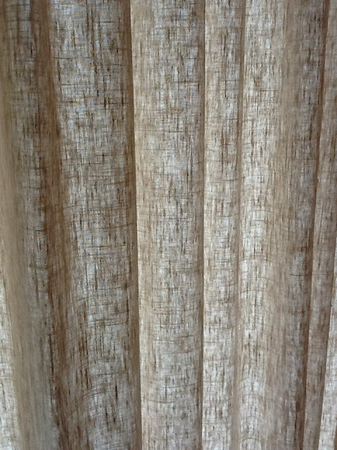
 This shade is the same color as the chair - but my guess is we keep all the shade in the same neutral cream - maybe in different weights of linen - the  weave will look stunning when the lights are on at night.


And then a single garden stool - maybe by the ottoman. 


THE ARTWORK


Wood furniture and artwork - and even these silver porcelain lamps -  will be enhances by a painted wall of tan.  Everything will 'pop' with this as the backdrop. 


CURTAINS

Because the living room and dining room are next to each other - but not combined - the look needs to be repeated. 


--------- DINING ROOM ---------

Clients dining room set.  The wood has a gray tone surrounded with light tan microfiber chairs. My look is a little more French country - but the client is contemporary...  So we compromised. 


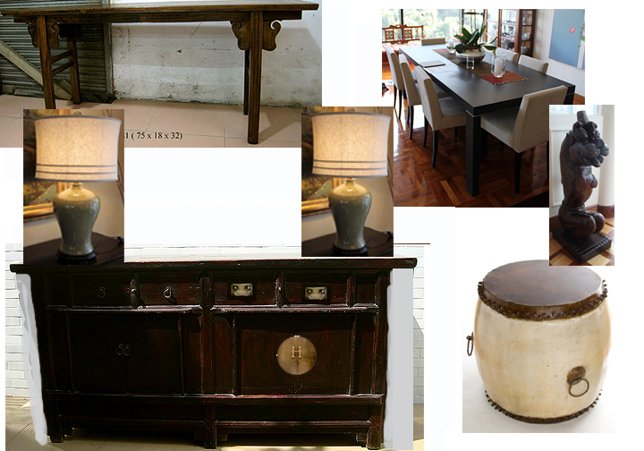
We're adding a simple alter table under the window flanked by 2 chairs.  Then a old sideboard is being refurbishing for the wall opposite the artwork housing 2 mustard crackled porcelain lamps.  Suggestion was to find a drum and finish it so the large statue would get off the floor and be noticed. 


The sideboards final stain and hardware.  Originally the design had alter table style wings.  I had them removed which created a longer top - this is good because repeats and fills the long wall where it's located. 

A mirror would be wonderful.  It reflects candlelight from the table and the artwork opposite it. Also added were a pair of these crackled porcelain lamps. 


More linen curtains.


The red bull is showcased on top of the alter table.


75 x 18 x 32

Ways to showcase with an alter table.  


Place baskets or trunks under the table to fill the empty space. 


This painting will take up the entire wall. 


FAMILY ROOM TV CABINET


We couldn't find anything old to refurbish to a TV cabinet so we designed this below.  I LOVE IT!  Simple is sometimes the best.
The glass doors are being replaced with frosted glass before it ships 

(we don't want to see the inside). 
We are also making sure that there are proper cut outs in the back for all the cords.  
And then adding lovely 'key's for the doors. 


I wish you could see the grain of wood in this photo - it's lovely. 


The family room needed a modern style easy chair - so this is the final product with a matching ottoman.  The ottoman opens up for additional storage. Again the photo does not do the fabric color justice - it's a lovely quality linen in soft taupe.


MASTER OTTOMAN
Then one more item for the master bedroom.  Again we could not find an old antique the right size and simple in design.... so we made this at
64" wide x 15" deep and 17" high
We want room in the height to add a 2" pad.